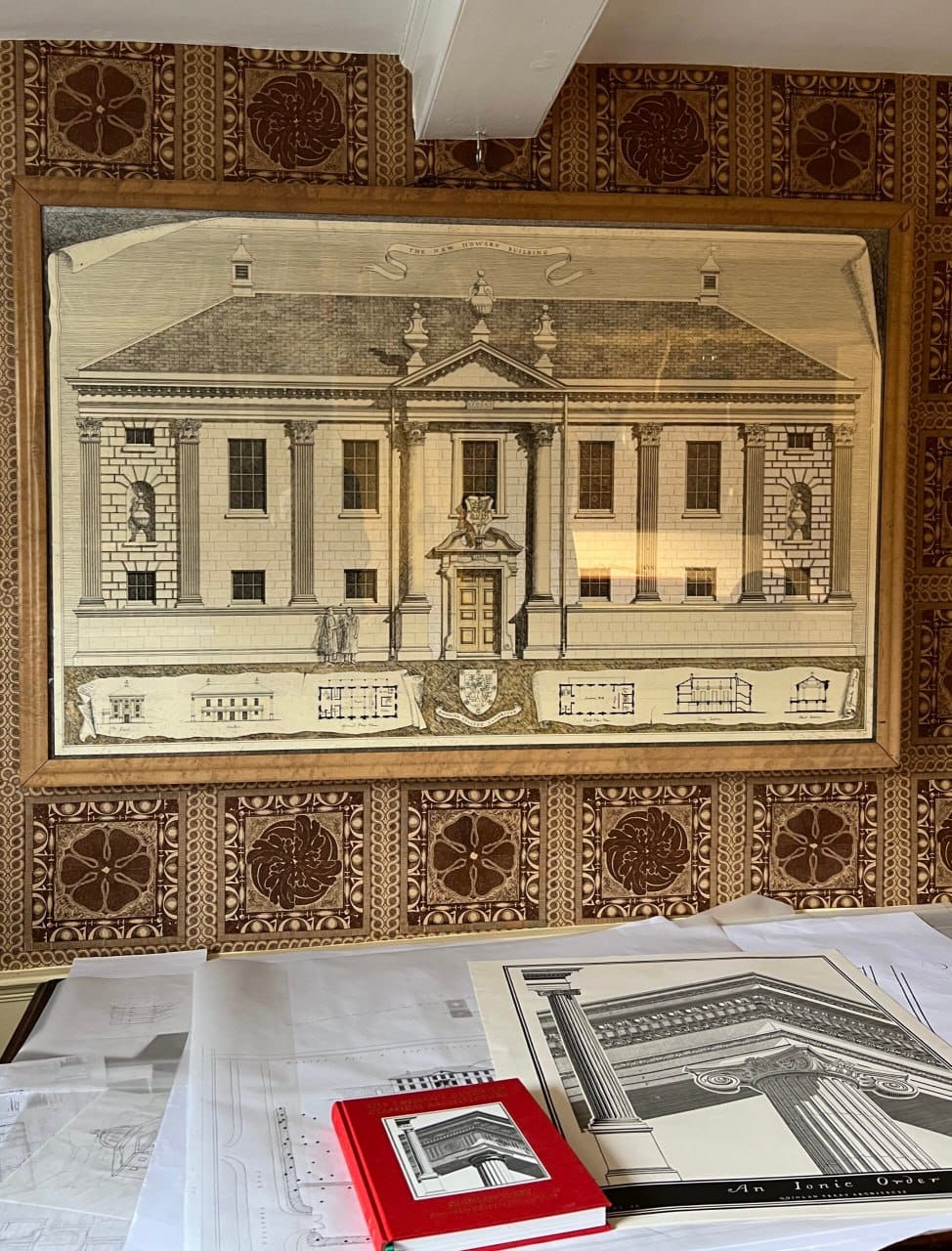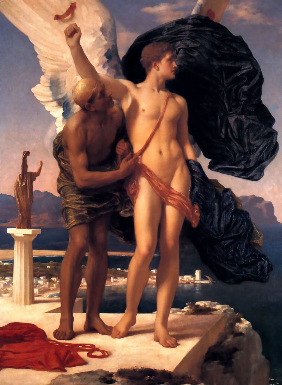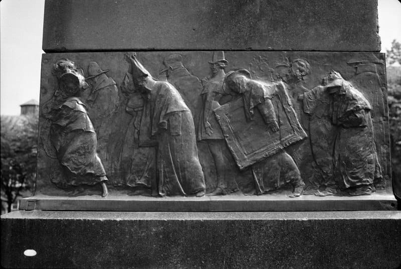
I thought the Pushkin Museum's previous logo was a failure, but now they have replaced it with something even more abstract: just four columns, although the portico of the main building rests on six

And yet they could simply have admitted the mistake of 2024 and gone back to the old logo, perfectly recognisable, informative and successful